Previous Newsletters
|
||||
|
MARKING TIME
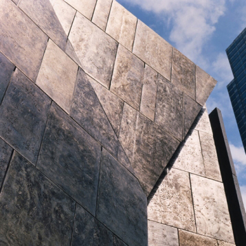
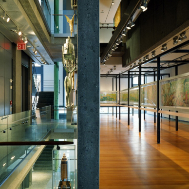
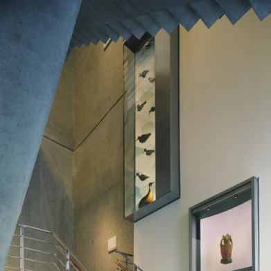
We are in the throes of a cultural opera set on 53rd st. The damsel in distress is the Folk Art Museum, the much lauded early work by Tod Williams and Billie Tsien that is about to be demolished. The villian is The Museum of Modern Art whose voracious appetite for real estate is rapidly gobbling up everything in its relentless march westward. Cast as the heros are Liz Diller, Ric Scofidio and Charles Renfro who are supposed to come up with a brilliant concept that would appease their client while cleverly integrating the little building into the reconfigured museum so that MoMA will step up to the plate and do the right thing. As architects, we know that the higher the project profile, the more people second guess design decisions. So, concerned citizens have formed committees, editorials have been written and symposia have been held. Since this is our architectural family, and we admire, respect, and support everyone involved, it is difficult to sit patiently on the sidelines while the drama unfolds. We confess that when we are given unsolicited advice on matters of self improvement, we take direction poorly. Our typical response is to listen intently, thank everyone profusely for all their good ideas, assure them we'll look into it and get back to them, and then proceed to do exactly what we were planning anyway. We suspect that MoMA may not be very different. And, that it is likely that in the not too distant future the Folk Art Museum's celebrated facade panels will be packed up and shipped off to a warehouse in a distant borough awaiting a future installation in an appropriate setting. And the architects will hopefully eventually repair their personal relationships. Cities grow and change. Buildings once emblematic of their age pass out of fashion. Many of the people who participated in shaping the urban environment are no longer with us. Sometimes all we are left with are the images, evocative of what the buildings they represent meant in the cityscape of their time. We thought it might be helpful turn to photography. Ezra Stoller took the iconic pictures that defined New York in the era of Mad Men. It is an extraordinary archive; it became the basis for our J-term project with our three Harvard Graduate School of Design externs at the BSA Space. Good architectural photography is a collaboration between the architect and the photographer because the images tell the story about the building to a much wider audience than will ever visit the building. Anton Grassl joined us and took us on a photographic exploration of one of the iconic buildings of that era, Saarinen's Chapel at MIT. Anton frequently collaborates with Machado and Silvetti who have dealt with issues of historical preservation in their work. We are highlighting both his work and theirs this month. It goes without saying that another way of marking time is through art. In 2010, for instance, the Cumberland River flooded Nashville. The Metro Nashville Arts Commission began its Watermark series, commissioning artworks for the neighborhoods that flooded. And finally, Lawrence Argent is our featured artist; some of his works, such as the Ghost Trolley pays homage to the formerly vibrant streetcar system. It is difficult to know what will resonate with a future generation. The best we can do is mark time: record oral histories, construct memorials, and archive the pictures. Abby Suckle, President |
||||
|
FEATURED ART COLLECTION: METRO NASHVILLE ARTS COMMISSION'S PUBLIC ART COLLECTION Nashville passed its public art ordinance in 2000. They have been grappling with the issues every city faces when they are developing a public art collection, namely commissioning art that is both relevant and engages the public.
Another program, the Watermark Series, commemorates the 2010 flooding of the Cumberland River. Works have been created that are situated in the affected neighborhoods.
Flood photo 2010
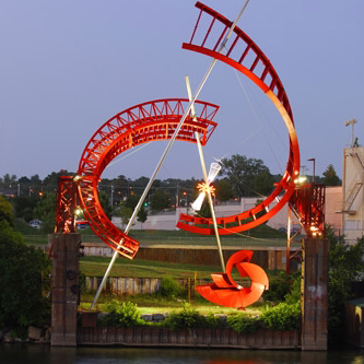
photo © Alice Aycock 2011
Ghost Ballet for the East Bank Machineworks (2007) |
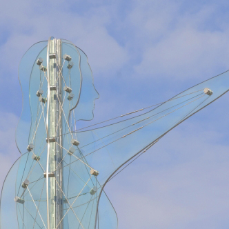 Citizen (2010) Thomas H. Sayre
Nashville, TN, Photo © Metro Nashville Arts Commission |
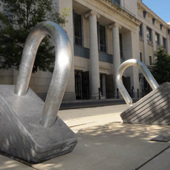 Emerge (2011) Matt Young,Nashville, TN Photo ©Metro Nashville Arts Commission |
||
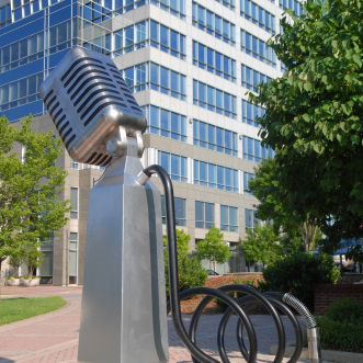 Microphone (2011) Keith Harmon, Mac Hill, Franne Lee |
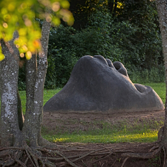 Watermark: Emergence (2012) Buddy Jackson Nashville, TN Photo ©Metro Nashville Arts Commission |
|||
|
|

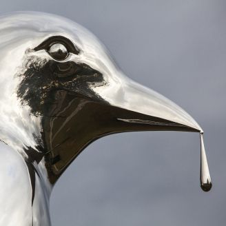
photo © Lawrence Argent / AllRightsReserved
I am Here (2013) |
Reflection Nashville, TN (2012) Metro Nashville Arts Commission Photo © Metro Nashville |
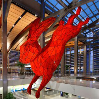
Leap (2011) Sacramento Art in Public Places
Sacramento, CA Photo © Ed Asmus |
|
|
|
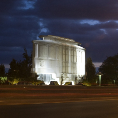
Ghost Trolley (2007) Aurora, CO, Photo© Lawrence Argent
City of Aurora Art in Public Places |
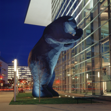
I see what you mean (2005) Denver Public Art Collection
Denver, CO Photo © Lawrence Argent
|
||
|
photo © Michael Moran
Architects photo © Michael Moran
LE TRICORNE: FOUR SEASONS RESTAURANT 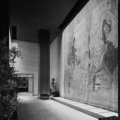
Photo © Ezra Stoller / ESTO
Artist:Pablo Picasso (1919) The fabric painting will be removed on February 8th to allow for repairs to the stone wall behind. It is very delicate and may not be able to be reinstalled.
UPCOMING: OVER TIME: DEFINING MODERN BOSTON THROUGH PHOTOGRAPHY 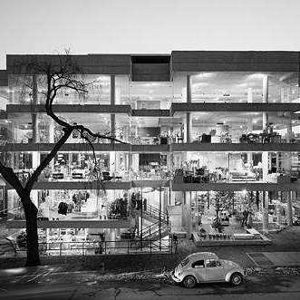
Photo © ESTO
Design Research
Date: Thursday, March 27 Moderator:
To celebrate the inaugural Boston Design Week, cultureNOW has partnered with the BSA’s Architectural Photography Network to explore the impact of photography in shaping our perception of the cityscape of Boston. The program includes presentations by some of Boston’s foremost architectural photographers followed by a spirited panel discussion. UPCOMING IN MARCH COCKTAILS & CONVERSATIONS: The Pairings: ENRIQUE NORTEN FAIA
&
UPCOMING WALKING TOUR:
|
||||
|
FEATURED ARCHITECT: MACHADO and SILVETTI ASSOCIATES When architects get commissioned to add to historic buildings, they often come up with design solutions consisting of new modern structures joined to the original building by glass 'spacers'. There is some validity to this approach because it allows the architect freedom from the physical constraints of earlier buildings constructed to different programs, with different materials and different technology. These schemes are rationalized by being (at least conceptually) cheaper, easier to construct, and less invasive. It is somewhat more challenging to give a building a 'facelift' while updating it and 'bulking it up'. Rodolfo Machado and Jorge Silvetti are noted for mastering this approach. They often use the historical fabric as the genesis of their designs. Major buildings include the classically inspired renovations to the Getty Pavilion and McKim Mead & White's Bowdoin College Museum of Art. But they shouldn't be pigeonholed. We thought that it might be more interestng to highlight several recently completed museums that are not traditional for them in order to illustrate some of the many routes possible when respectfully adding to an existing building or space. The Chazen Museum of Art for instance, doubled the size of the existing 1970 Harry Weese designed building at the University of Wisconsin in Madison. Charlotte's Mint Museum combines two facilties to create a cultural campus as part of an urban development. And, the Ruth and Elmer Wellin Museum of Art at Hamilton College created new facilities to attract more and better students. The MBTA Head Housesat South station are the subway entrances at the Red Line on the Greenway. Here the challenge was to create a readily recognizable sculptural form to signify the entry point. |
||||
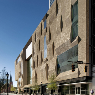
The Mint Museum (2010) Photo © Anton Grassl/ESTO |
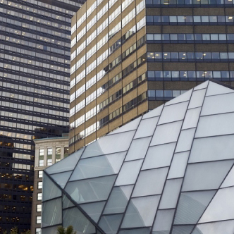
MBTA Head Houses (2006) Boston, MA
Machado and Silvetti Photo © Anton Grassl/ ESTO |
|||
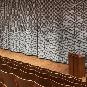 Chazen Museum of ArtMadison, WI, Photo © Anton Grassl/ESTO |
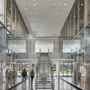
The Ruth and Elmer Wellin Museum of Art (2012) Clinton, NY |
|||
|
|
||||
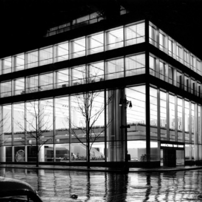
Manufacturer's Hanover Trust (1954) New York, NY
Skidmore Owings & Merrill Photo © Ezra Stoller / ESTO |
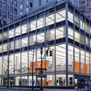
510 Fifth Avenue (2012)
New York, NY
Skidmore Owings & Merrill Photo © Eduard Hueber |
|||
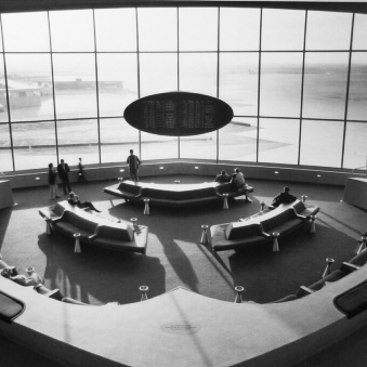
TWA Terminal (1962) Queens, NY
Eero Saarinen Photo © Ezra Stoller /ESTO |
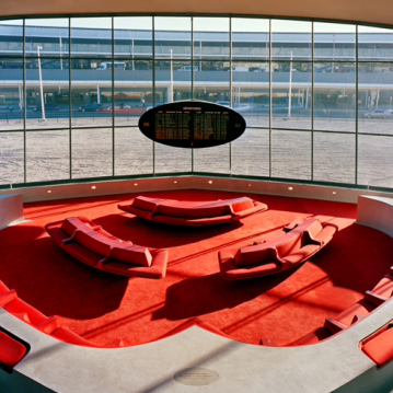
TWA Flight Center (2011) Queens, NY
Beyer Blinder Belle Photo © courtesy of the Port Authority |
|||
|
| ||||
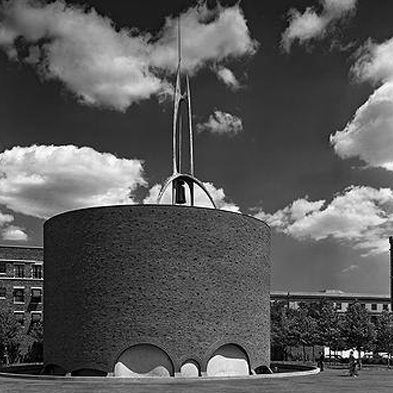
MIT Chapel (Bldg. W15) (1954) Cambridge, MA
Eero Saarinen, Photo © Ezra Stoller / ESTO |
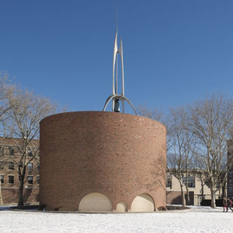
MIT Chapel (Bldg. W15) (1954) Cambridge, MA
Eero Saarinen, Photo © Anton Grassl / ESTO |
|||
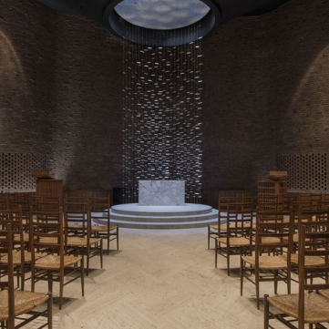
MIT Chapel (Bldg. W15) (1954) Cambridge, MA
Eero Saarinen, Photo © Anton Grassl / ESTO |
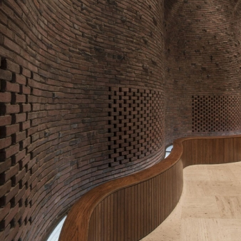
MIT Chapel (Bldg. W15) (1954) Cambridge, MA
Eero Saarinen, Photo © Anton Grassl / ESTO |
|||
|
||||


